

Cidon are a national contractor specialising in reinforced concrete works since 2000, with bases in England and Scotland. NX worked closely with Cidon's comms team to develop a logo, brand and values revamp which aligns with their groundbreaking, industry leader approach and reinforces their already stellar reputation.
The process we went through learning about Cidon's evolution and ethos was insightful and helped us to design an effective visual identity that looked forward whilst also retaining their core values
BACKGROUND
Cidon tracked us down after seeing our work for Lane End, rebranding them from the top-down – and designing their new website, consulting on marketing strategy and collaborating with HashaTech on a bespoke app for their internal comms and workflow.
We collaborated extensively with Neilson Reeves Photography, working closely on imagery and photography to find the most suitable images for website, print and social media for both Lane End & Cidon. Colin at Neilson Reeves has a great knowledge of form with a unique eye for detail and an infectious enthusiasm; which garners the praise of both clients and their customers. Cidon wanted to retain their 'family-feel' company dynamic whilst expanding into Scotland and Canada from their original Barnsley based head office. Expanding a business always comes with growing pains and can it be easy to lose that sense of family and belonging, when it becomes diluted or spread out over a large area – so this became our biggest challenge.
*Cidon Crane, image credit: Neilson Reeves Photography
GOALS
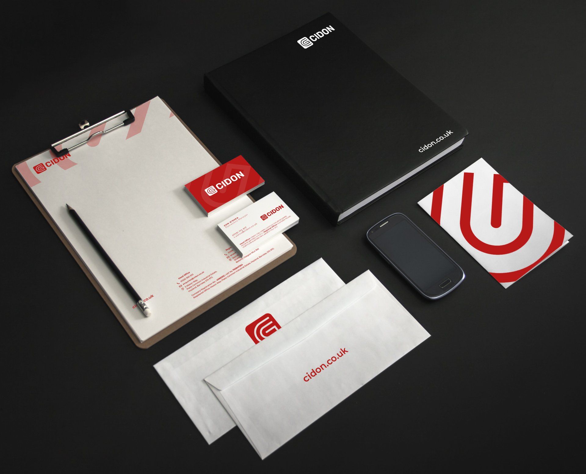
> Design a logo and brand which represents Cidon's core values
> Create unifying emblems which celebrates everyone who works for Cidon
> Increase coordination and collaboration across the company using quality internal comms and processes
> Unify the disparate teams and departments by giving them a voice
> Bring Cidon's visual comms up-to-date to help them retain their competitive market position
PROCESS
CONSULTATION AND RESEARCH
It was important for Cidon that their staff were involved in every stage of the re-brand so we conducted interviews with staff members in both the head and regional offices. Our aim was to get an idea of Cidon's core values, ethos and how they wished to see the company evolve and grow with its new visual identity.
LOGO DEVELOPMENT
From the feedback from staff and consultation with management we developed 6 concepts and logos that we thought would modernise their visual identity whilst retaining what's most important to them; the happiness of their team.
INTERNAL BRANDING
Once the external branding had been decided we set about overhauling Cidon's internal identity. To improve communications and become more organised and efficient we re-branded and standardised all internal documents, from project case studies to newsletters and tender submissions.
BRANDING COLLABORATION
It was an absolute pleasure to work alongside Northern Exposure on this project. To get a well rounded and thorough understanding of the company, we interviewed key members of staff from each branch and got their take on Cidon's principles, personality, current image, community outreach programmes and more.
RESULTS
Cidon Construction now has a strong and contemporary look and feel that matches the efficient and high quality service they provide in the construction sector. Whilst modernising their internal and external visual identity, we made sure Cidon maintained their core values and company ethos.
SERVICES PROVIDED
Branding // Internal Re-branding

Northern Exposure | Container 112 | Pollard Yard
15 Pollard Street East | Manchester M40 7QX
Splash footage Jess James
We use cookies to ensure that we give you the best experience on our website. To learn more, go to the Privacy Page