BUILDING ECONOMIES THAT EVERYONE CAN SHAPE
Economy is a network of students, academics and professionals which researches, teaches and campaigns for improving and changing economics for everyone.
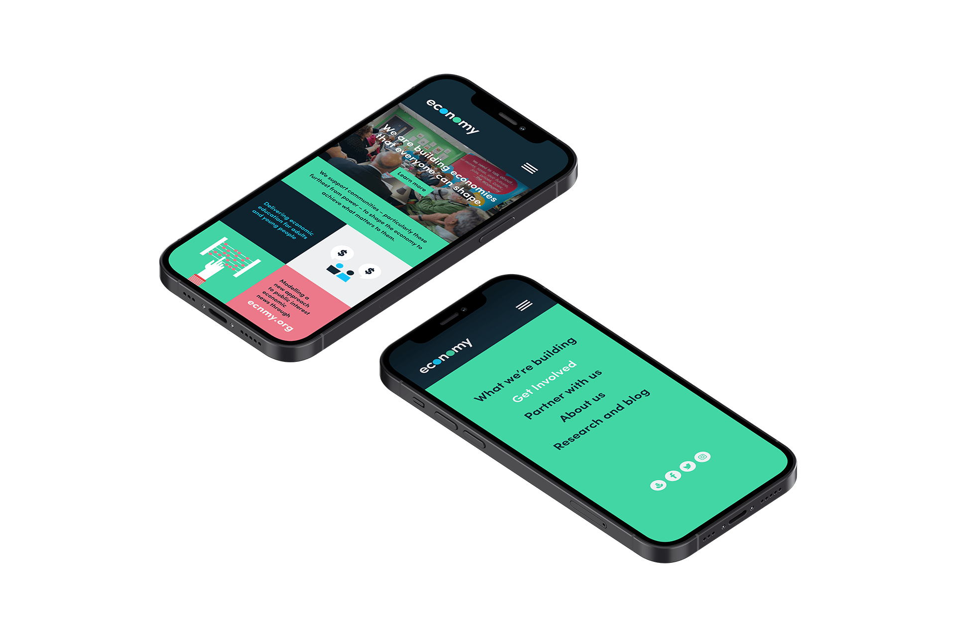
Since 2018 we've developed a good relationship with Economy, working on a range of print projects. They got in touch with us with an exciting brief to design a new website to sit alongside their existing news hub.

DIGITAL
It was important for the team that the new design would stand out from their existing site but would still be recognisably Economy.
One of the strongest aspects of their brand is their vivid and varied colour palette so we quickly realised this was our best tool in achieving their goals. We inverted the colour palette from light to dark, moving away from white space and replacing it with colour. This, coupled with a change in layout produced a great contrast between the two sites.