

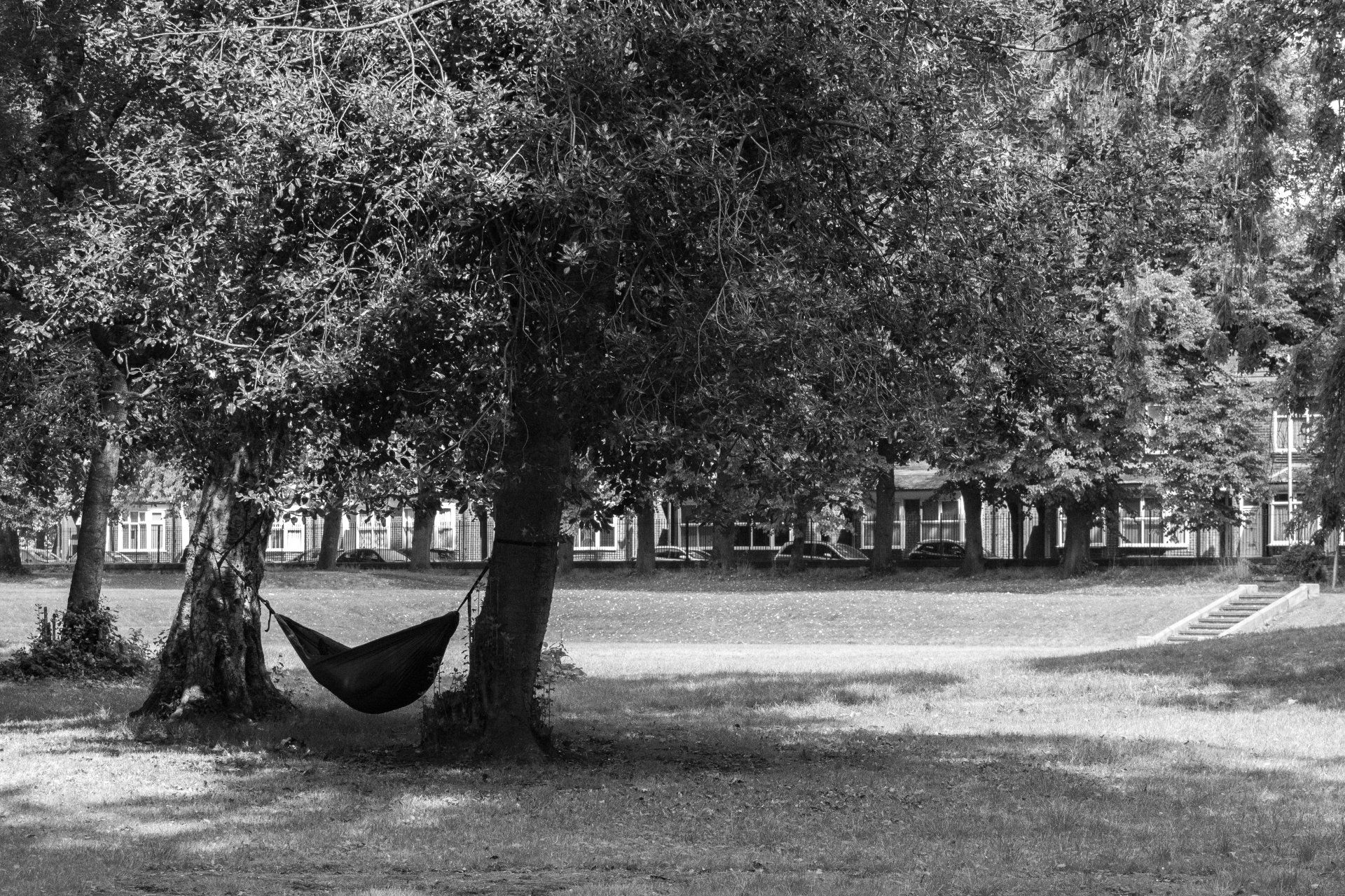
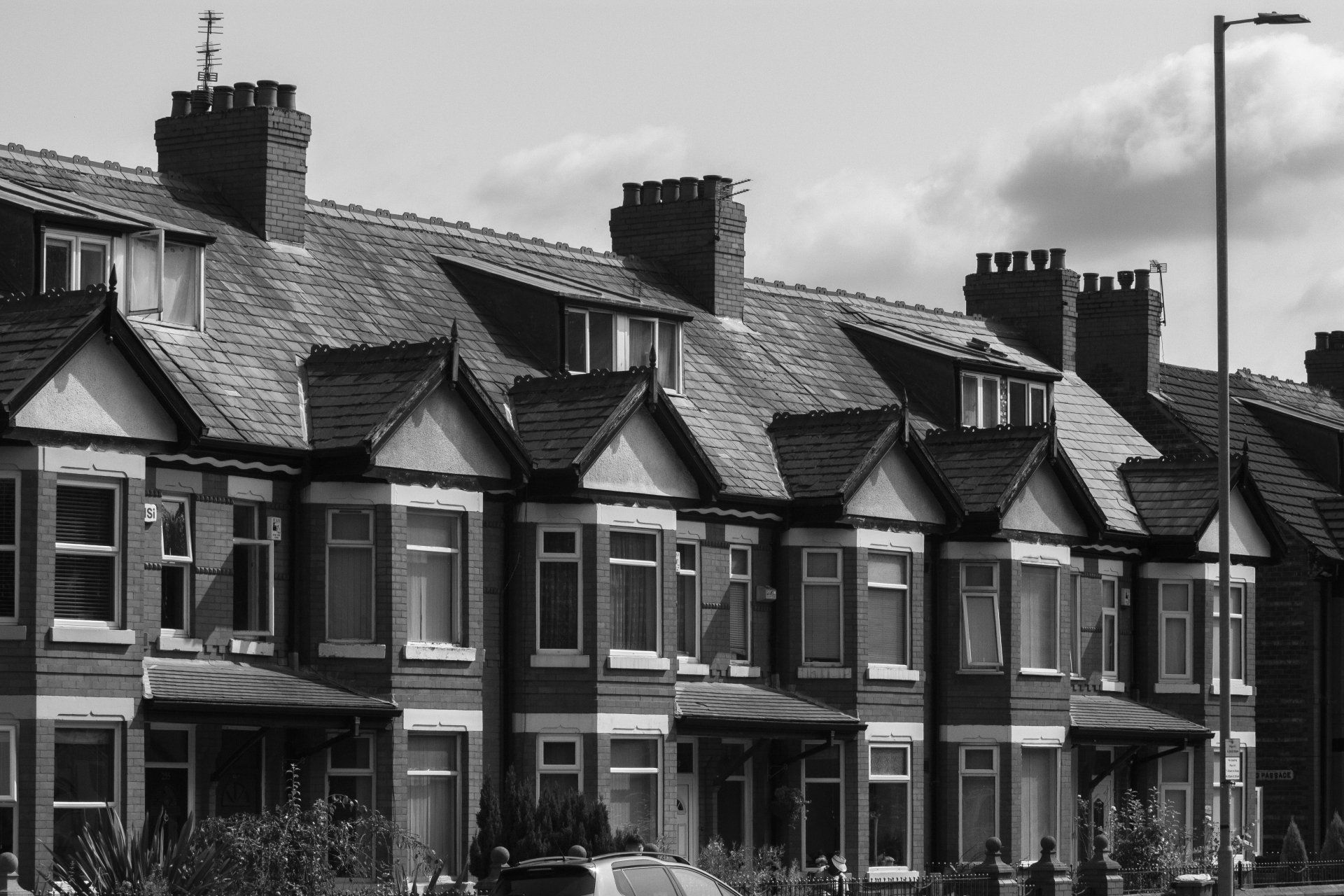
PowerUp Manchester is a not-for-profit organisation setup by One Manchester to disseminate information regarding reducing energy consumption and consequently saving money. Having successfully collaborated on the StepUp Mcr project together in 2019, One Manchester approached us to be involved. The project is initially aimed at the Manchester districts of Moss Side, Longsight & Clayton but with a view to extending this to Greater Manchester and beyond once the success and effectiveness has been evaluated.
We have worked in collaboration with
HK Writing
to produce a logo, branding, brand guidelines, responsive website and a series of printed posters and booklets to launch the project. As with StepUp Mcr we spent time consulting with local community leaders and workshops with steering groups to most effectively communicate the ideas and information to the local population, which is a diverse and broad church.
PowerUp is a free service for moss side, longsight & clayton. here to share useful advice and information, for those aiming to manage their homes more efficiently and improve their overall quality of life.
NAME AND LOGO
At all stages we incorporated the feedback we acquired from the local community and steering groups, which we used as focus groups for our ideas and planning. The name PowerUp was chosen after much deliberation about connotations and how the brand might be visually represented to appeal to a wide audience across social and cultural boundaries.
Originally the concept was derived from the idea that the term was fairly ubiquitous across generational lines as either a positive reference to gaining an advantage in a computer game scenario or quite literally giving power (in this case esoteric information) to people by providing them with ‘the facts’ and the right to decide for themselves how much they adopted in the process.
The logo followed on from this concept in a fun and accessible way by creating a versatile character which would be instantly recognisable as a source of trustworthy information. Although quite literal in the sense of representing the name, the logo will appeal to a broad audience. As it was clear from the beginning of our research, that young people would be an important tool in encouraging changes in habit and lifestyle from their family and elders. We concluded that ensuring that it was a fun and positive emblem combined with bright, warm and vibrant colours was hugely valuable to its success and uptake. Children can be persuasive…
BRANDING
Branding followed, directly informed by our research and decisions on the name and logo. The branding needed to be bold and exciting, representing the area, people and purpose of the project. The branding consists of modular squares of colour which abstractly represent the rooms of a house, the colours are bold and warming and therefore imply a cosy and warm environment. As from qualitative research conducted by One Manchester the feedback strongly indicated that people would respond more positively if there was an emphasis on home, family and community rather than specifically saving energy or money.
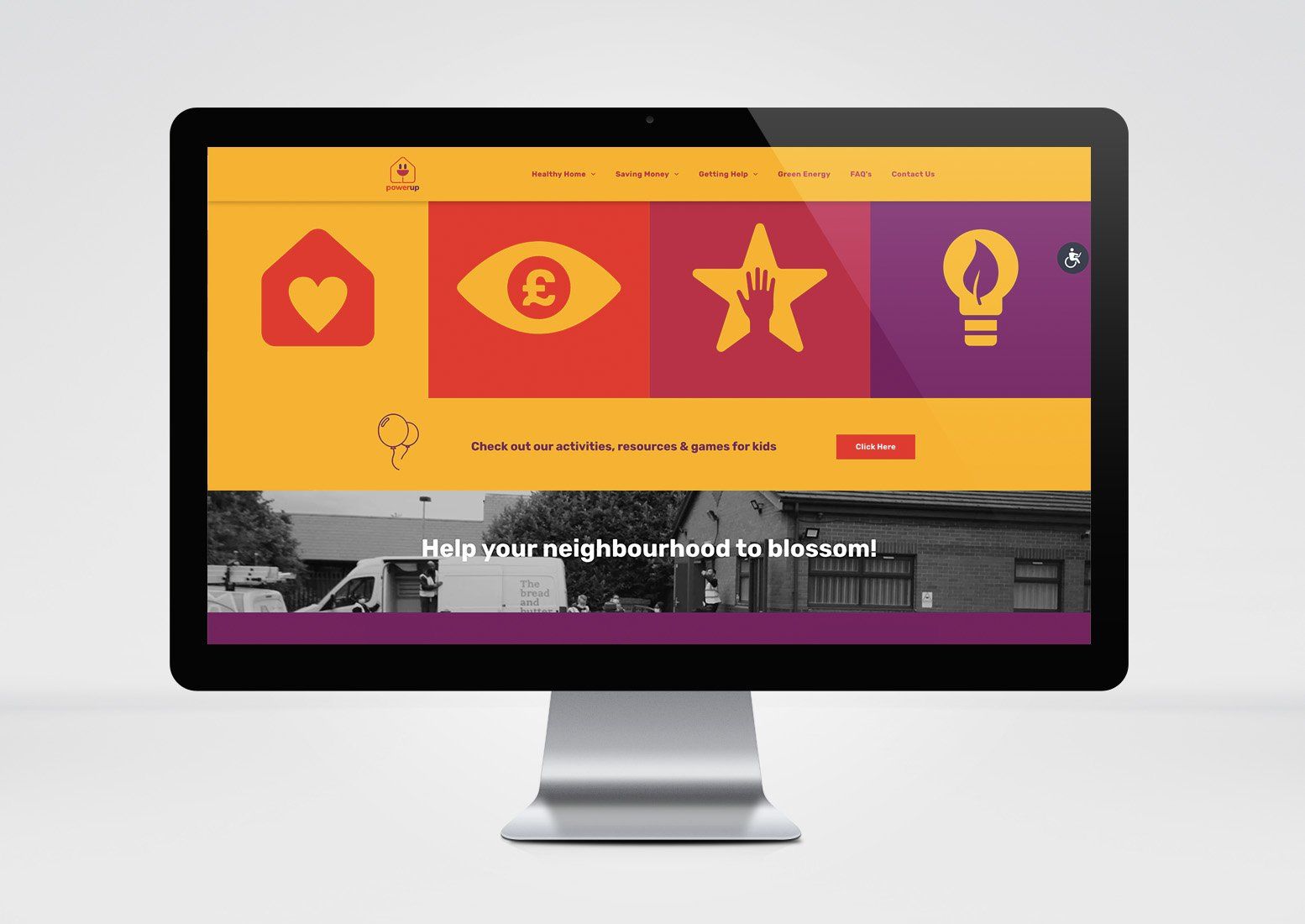
WEBSITE
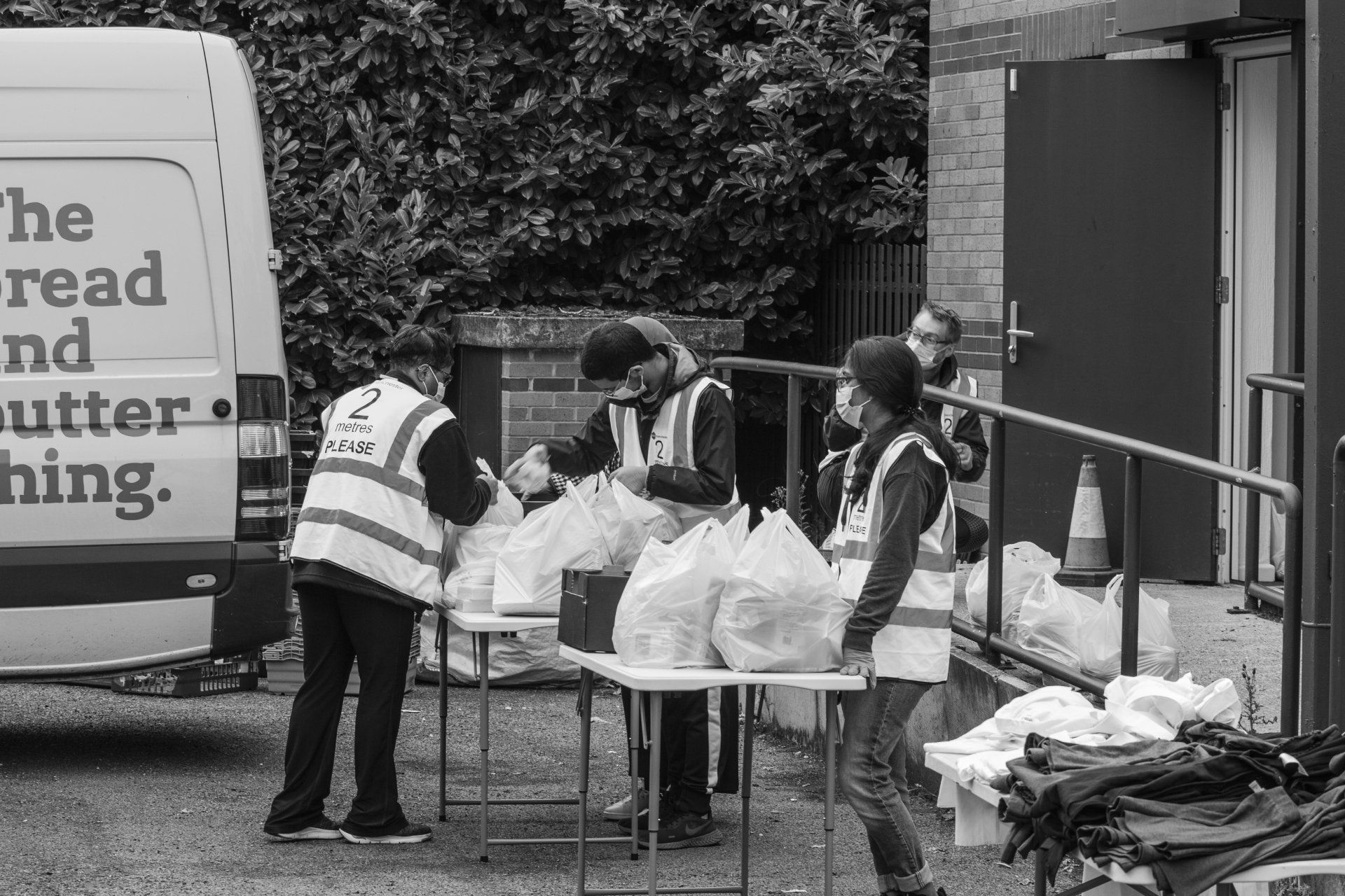
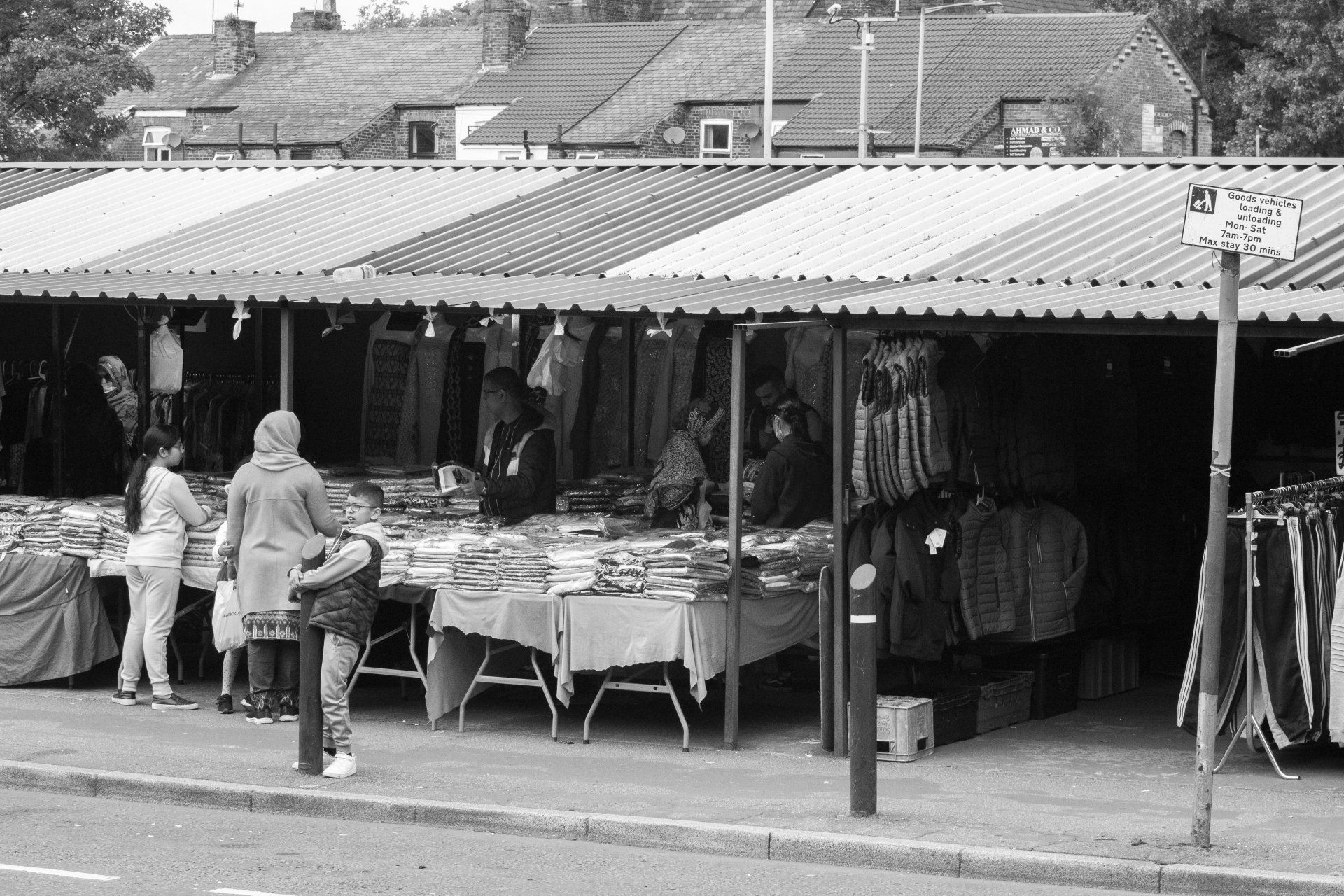
We developed a colourful and fully accessible website, applying the blocks of colour in a modular layout creating an enjoyable user experience which translates well across all devices and platforms. We sent our in-house photographer to various highlighted locations and events across the the three wards of Moss Side, Longsight & Clayton; including the famous Longsight Market and The Bread & Butter Thing. The images help to root the project in the neighbourhoods and communities they are aimed at, complimenting the brand with a human element which can otherwise be hard to recreate.
The websites’ purpose is essentially to provide a fun and accessible resource for sharing ideas about how to reduce energy consumption and save money in some of Manchester’s poorest and most diverse neighbourhoods. There are tips and tricks for adults, activities for children to inspire and inform them and plenty of useful contacts and resources to promote further reading and opportunities. The website also prompts users to share their stories and experience so that PowerUp Manchester can build some human interest articles to further promote the cause and appeal to a wider audience. There are also call-to-actions for social engagement and joining mailing lists for news and updates to be sent directly to users.
We hope to work with One Manchester and HK Writing in the near future to further develop the website as an information resource, and allow people to feedback to help shape the future of the websites user experience.
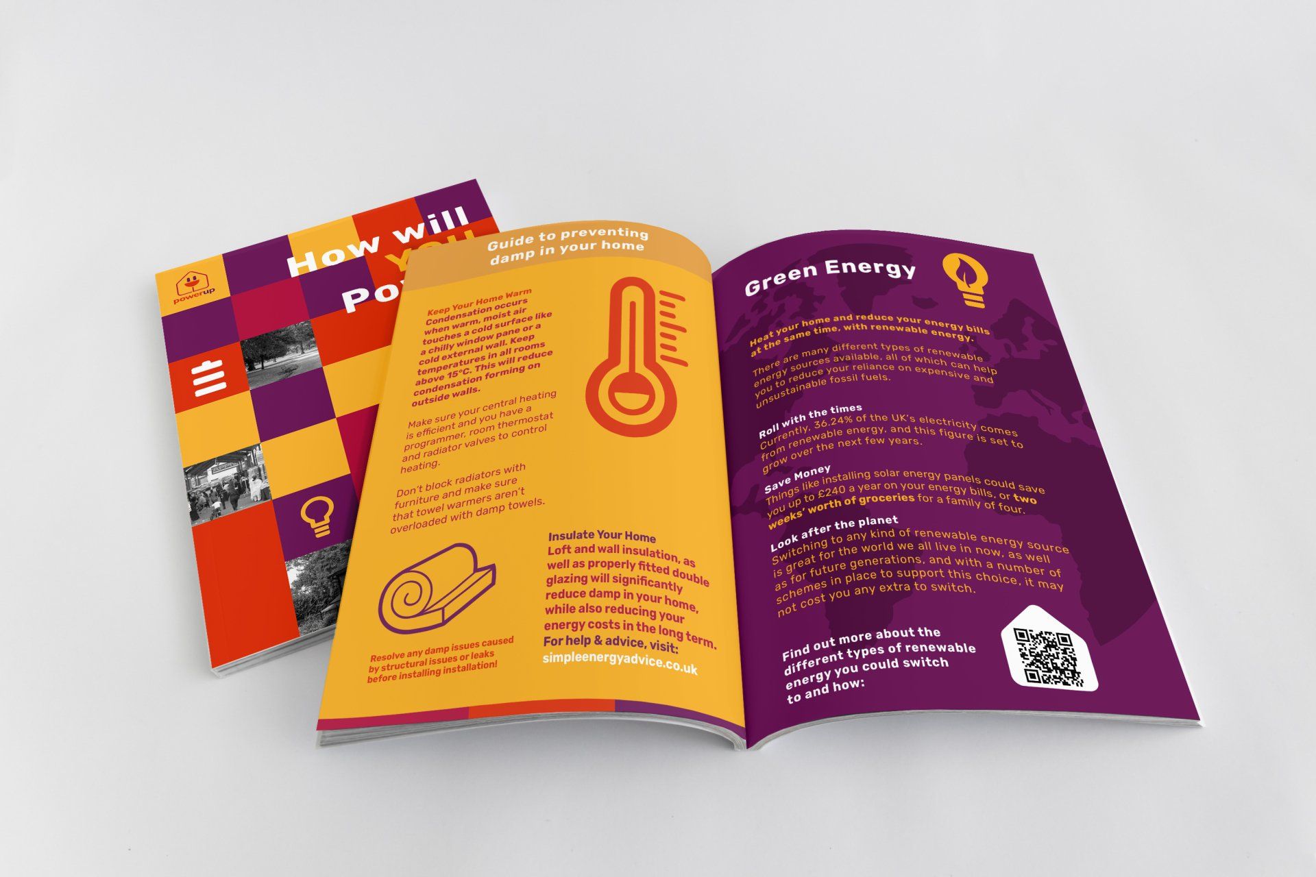
Alongside the launch of the website and social media campaign, we produced a series of four posters each themed with the four elements of the scheme i.e. Healthy Home, Saving Money, Getting Help and Green Energy. The posters were distributed across Manchester, and concentrated in the three main wards – giving a short overview and encouraging viewers to further reading on website and engagement through the social campaign. As a large number of people in areas of Manchester don’t have reliable internet access we designed an information booklet; which is a condensed version of the website. This contains all the key elements from the website and encourages further reading if possible.